
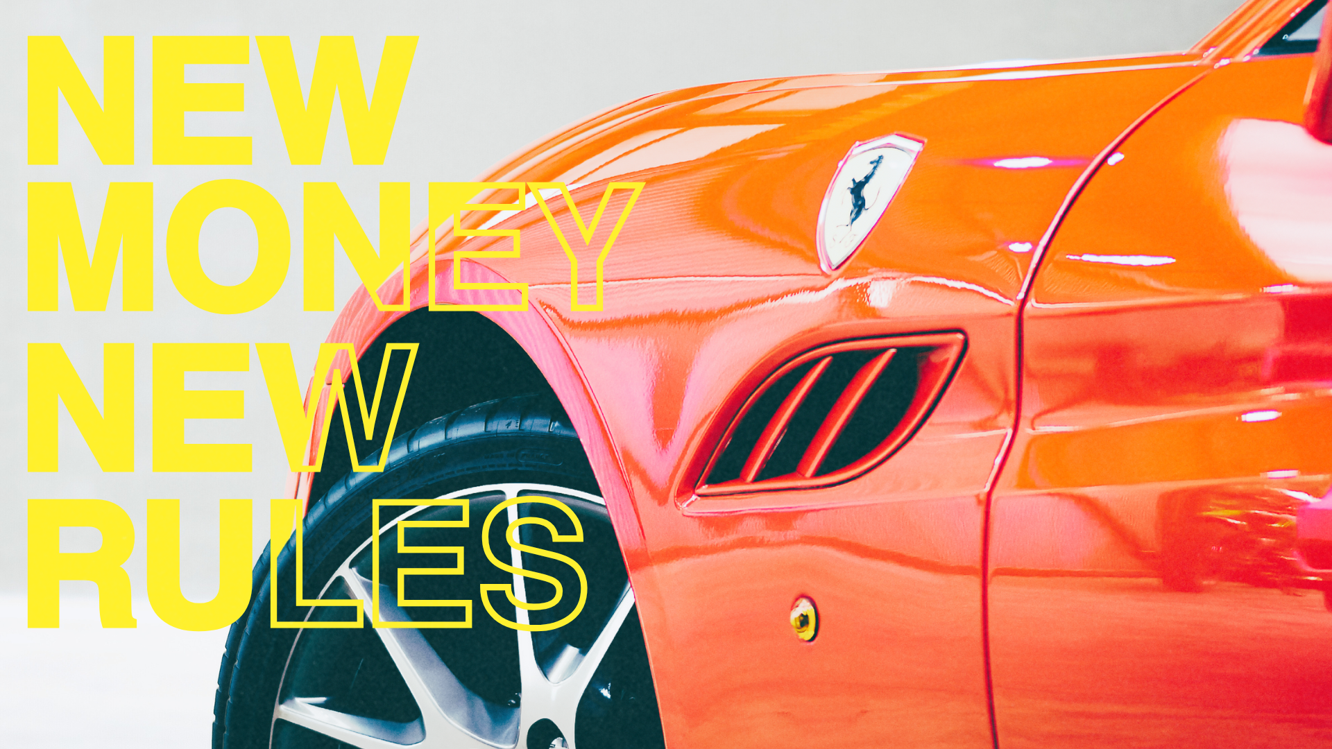
Emifast didn’t want to copy competitors’ “old money” aesthetic. They needed a new face, one that spoke to young entrepreneurs chasing global opportunity. We built their entire social media presence from the ground up, crafting a visual identity rooted in bright vintage luxury, bold typography, and street-inspired energy.
Time for a face lift.
CREATIVE BRAND STANDARDS
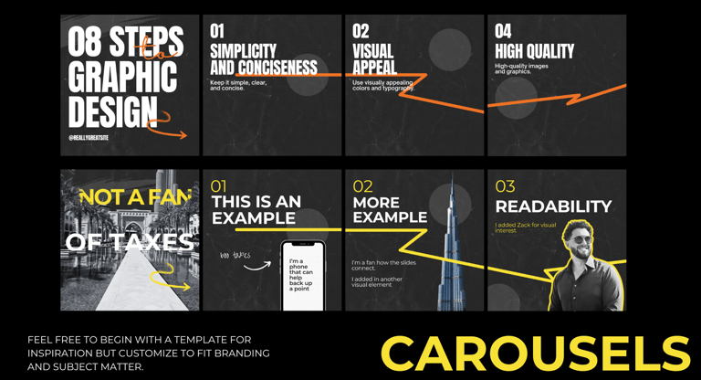
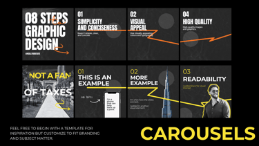
We developed a full social branding guide that defined Emifast’s new creative direction. Designers were trained on a system of oversized typography, vibrant imagery, and retro-inspired textures, ensuring consistency across platforms.
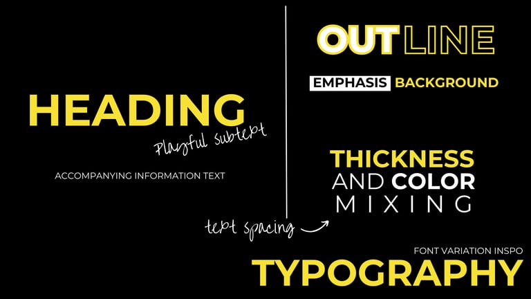
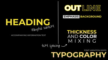
TYPOGRAPHY
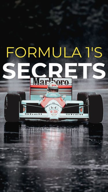
Text as focal point. Oversized, bold, mixed with softer handwritten notes. Capitalized fonts paired with scrawled subtitles.
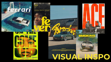
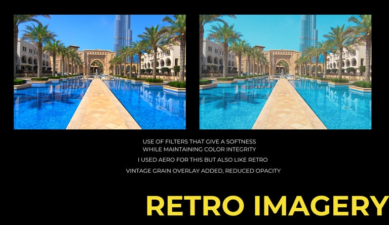
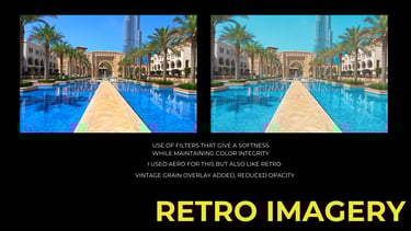
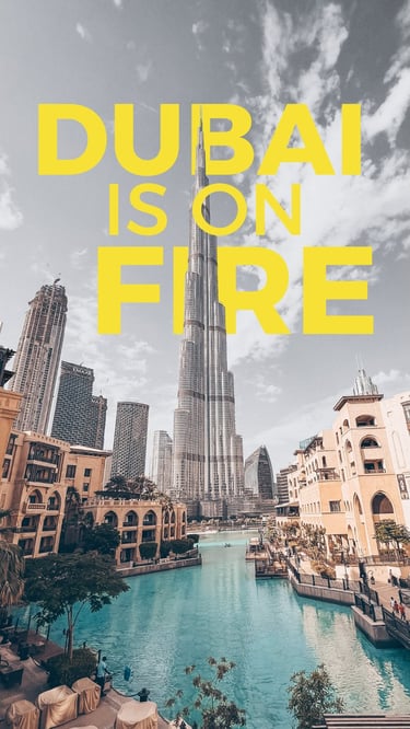
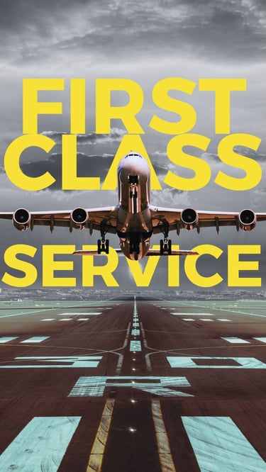
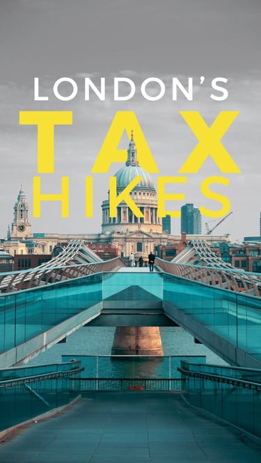
VISUALS
Luxury car ads, hip hop covers, vintage filters. Nostalgic but aspirational.
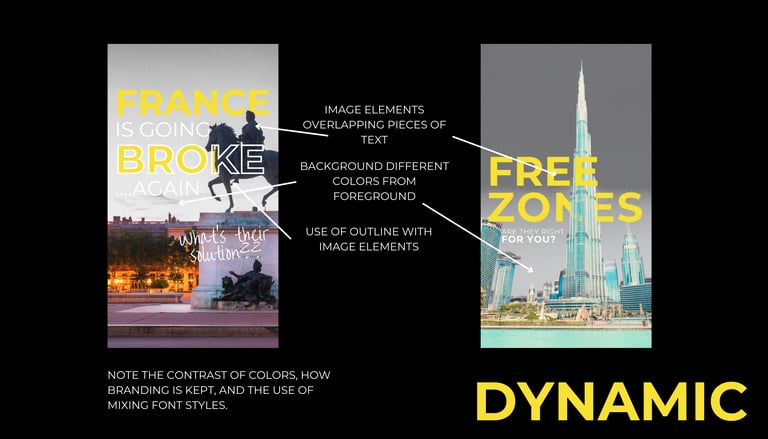
DESIGN ELEMENTS
Grain, contrast, layered type + photo compositions. Imagery and text fused together as one editorial design.


EXECUTION ACROSS PLATFORMS
Instagram, LinkedIn, TikTok, and Facebook rolled out the new look. Visuals leaned into high-contrast, editorial layouts designed to stop the scroll and reframe Emifast as bold, modern, and unapologetically different.
OUTCOME
The creative overhaul established Emifast as a forward-facing brand in their sector.
530% increase in post views
+108% LinkedIn profile visits
+60% link clicks
STRATEGY-LED SOCIAL MEDIA. DONE RIGHT.
contact Nathan
hello@trioncreativemedia.com
502-203-1230
© 2025. All rights reserved.